WA 211
Project Background
In 2021, I completed a consulting project with Washington 211. I collaborated with a team of three researchers to conduct comprehensive accessibility research and usability testing. Our goal was to enhance the user experience for diverse populations including those with cognitive impairments or mental health issues. Through a combination of in-depth user interviews, usability tests, and accessibility assessments, we identified key barriers and opportunities for optimizing the platform’s functionality. This project provided actionable insights that contributed to more inclusive design recommendations, ensuring Washington 211 could better serve individuals with varying needs.
What is WA 211?
Washington 211 is a state-run web and phone service that connects people to critical community resources to address the whole person.
Who uses WA 211?
What were they looking for 2019-2020?
What are they looking for 2020-2021?
Target participant group
Utilizing WA211 data and WA demographics information,
our target participant group may:
have cognitive impairments and/or
mental health disorders and/or
limited English proficiency and
limited income and
a variety of critical resource needs, including housing
and rental assistance
Josh (211 Stakeholder) provided us with guidance regarding who WA211 would like to focus on.
Recruiting difficulties
Recruitment activities included:
One survey for target participant group
One survey for proxy participants
Phone calls to local agencies
Distribution of surveys to:
WA 211 network of agencies
UW CREATE (Center for Research and Education on Accessible Technology and Experiences)
Facebook groups
Extended personal networks
We took a step by step process of expanding the pool of possible participants. We started with a survey for people with cognitive impairments and/or limited english proficiency and/or mental health disorders and distribution to the WA 211 network. As time passed, we expanded our potential participants to proxies and a wider distribution of the general proxy survey to our networks.
Despite these ongoing efforts, we were unable to recruit any target participants and utilized proxies in the usability testing.
Research Questions & Methods
Are users able to successfully and efficiently find community resources they need using the WA211 mobile site? | Quant. & Qual. |
|
What are users’ emotional experiences like as they navigate through the website? | Qual. |
|
How do the current website structure and interface affect ease of use and user’s emotional experiences? | Qual. |
interface |
How does user experience compare between wa211.org and 211ct.org? | Quant. & Qual. |
|
Talking with Josh we found out about the need to know information and examining the website lead us to these key research questions. In order to evaluate these questions, we used both qualitative and quantitative methods to obtain data. Qualitative data included think-aloud commentary, reported feelings, and reasoning about ratings. Quantitative data included number of clicks to complete tasks, number o errors made, and likert scale ratings of difficulty.
Emotions chart and Likert scale
Examples of emotion chart and likert scale presented to participants. Both visuals are gender and race neutral. These allowed participants to better understand what the likert scale rating of 1 or 5 meant. They also provided participants with possible emotions to choose from, which we hoped would help those with cognitive impairments better reflect on their emotional experience. We chose a 1-5 scale for the likert because we wanted enough variety and nuance without providing too much. We had discussions about what the difference between a 6 and a 5 on a 1-7 likert might be and if those with cognitive impairments would be able to make that distinction.
We did some research on basic emotions and discovered Ekman six basic emotions: fear, anger, joy, sadness, disgust, and surprise. We provided those as options, as well as other emotions. We also allowed participants to select emotions not listed on the chart.
Usability test details
7 participants
4 desktop participants
3 mobile participants
All sessions conducted remotely using Zoom
We were able to recruit 8 participants to take part in our usability test. All sessions were conducted using Zoom and participants were asked to share their screens.
Each participant was asked to complete 3 tasks on both WA211.org and CT211.org
1. Find the search bar or search categories
2. Find a resource.
3. Locate eligibility requirements for chosen resource.
Each participant conducted these three task on WA 211 and CT211. In order to minimize bias , we randomly selected some users to begin the test with the WA211 site and others began with CT 211. Together with our client we decided to test the website from the perspective of users accessing it to find help.
Test Scenarios
Imagine you are helping a friend find rental assistance. Using this website, how would you begin your search? – Task 1 Locate Search
I want you to still imagine you are helping a friend find rental assistance in Seattle (or Hartford for 211ct.org). Using this website, how would you find a resource? – Task 2 Find Resources
Now that you have found some resources, imagine you want to find out if your friend is eligible for a resource you found. Can you show me what you would do to find out? – Task 3 Check Eligibility
To make the task more digestible and relatable, we created a scenario to accompany each task. We selected rental assistance as the type of resource our participants would look for
Quantitative findings: Task 1 Locate search
211 CT
100% – Task Success Rate
0% of participants needed a hint to complete the task
1.71 clicks on average to complete the task MAX 3
14% of participants made an error while completing the task MAX 1
100% of participants who made an error recovered
0.14 average number of errors
0 participants needed intervention to recover
WA 211
100% – Task Success Rate
14.3% of participants needed a hint to complete the task
4.7 clicks on average to complete the task MAX 14
28.6% of participants made an error while completing the task. MAX 4
100% of participants who made an error recovered
0.71 average number of errors
1 participant needed intervention to recover
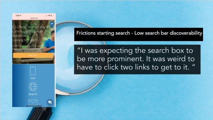
100% of the errors made during task 1 were related to wayfinding and path errors. For example, on WA 211 one user clicked the accessibility menu expecting to find a menu or search feature. On 211 CT the user scrolled past the search bar and ended up on a page
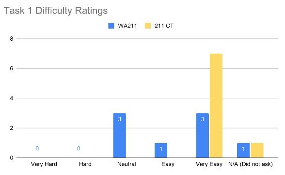
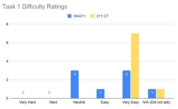
After each task we asked each participant to rate the difficulty level the task on a scale of 1 through 5, with 1 being very hard and 5 meaning very easy. One participant was not asked these questions due to time constraints
Quantitative findings: Task 2 Finding a resource
211 CT
100% – Task Success Rate
0% of participants needed a hint to complete the task
3 clicks on average to needed complete the task MAX 9
0% of participants made an error while completing the task
WA 211
100% – Task Success Rate
0% of participants needed a hint to complete the task
2 clicks on average to needed complete the task MAX 5
14.29% of participants made an error while completing the task
100% of participants who made an error recovered
0.2 average number of errors
0 participants needed an intervention to recover
After each task we asked each participant to rate the difficulty level the task on a scale of 1 through 5, with 1 being very hard and 5 meaning very easy. One participant was not asked these questions due to time constraints
Quantitative findings: Task 3 - Determine Eligibility
WA 211
100% – Task Success Rate
100% – On-site completion
211 CT
100% – Task Success Rate
100% – On-Site completion
Quantitative findings: Entire Task Difficulty
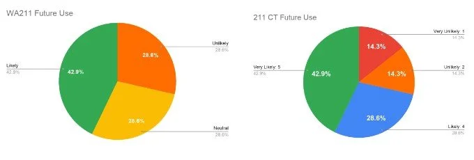
Quantitative findings: Future Usage
Quantitative findings: Recommendations
Emotional Word Clouds
Washington 211 word cloud
Connecticut 211 word cloud
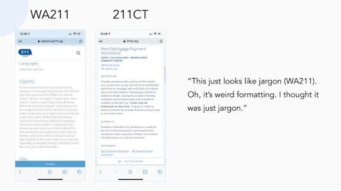
Recommendation for text-heaviness of resources
Use bullet point lists to further section information
Use darker / heavier fonts and have more line separation
Implement Tooltip for difficult to understand words or phrases
Recommendation for frictions getting to search
Decrease visual prominence of the covid banner and the chatbot
Covid banner: Provide an option to close / Give it less screen space / Use less red
Indicate the function of covid chatbot on its icon, instead of having a text box for explanation
Move the search bar to the home page
Move the search bar within the viewport, or make the bars a bit shorter (see CT 211)
Make clickable items into buttons or add underlines onto clickable texts
Recommendation for accessibility icon
Use the international symbol of access
Change hover effect label to state “Accessibility” instead of “Hide” on desktop
We also noted that the search page did not contain an accessibility icon or a language selection. Integration of those within the search page would be beneficial to target group use.
integrate search into the main site or add a language change button on the top of the search page
Recommendation for text-heaviness of resources
Use bullet point lists to further section information
Use darker / heavier fonts and have more line separation
Implement Tooltip for difficult to understand words or phrases
Interface Issues & Recommendations
No clear indications on whether some elements are clickable
Icons or just display graphics?
Recommendation:
Make clickable items into buttons
add underlines onto clickable texts
Interface Issues & Recommendations
Suggested search blocked completely by keyboard on mobile view
Recommendation:
Move the search bar up within the viewport
Put the suggested search list under the first text entry box instead of below “search”
Reflecting on our study
Be flexible when moderation of plan is necessary, and communicate with proper rationales
Anticipate participant’s needs and be sensitive
Have detailed written guidelines on how to collect data for inter-researcher consistency
It’s never too early to start recruiting
