UCLA Health (STAND Program)
UCLA Health
(STAND Program)
UX Research
Improving Student Registration
and Mental Health Screening
Summary
The STAND program is a part of a large UCLA research initiative that provides screening and mental health treatment for students according to their level of depression or anxiety. As a treatment network consistently seeking to innovate, they needed help figuring out the needs of students interested in or apart of the the treatment study and improve their experience when they register for the program. To inform the design strategy for an upcoming redesign of the program’s website and online registration process, I implemented UX research methods including story mapping, competitor research, usability testing, and user interviews.
Why was this research crucial for UCLA’s STAND Program?
To ensure continued participation in anxiety and depression research studies, it was essential to provide student patients with a seamless experience in registration, mental health tracking, and website navigation. Research participation can feel intimidating, so creating a welcoming and user-friendly process was crucial to making students feel comfortable and supported from the start. Simplifying access and usability helped reduce barriers and encouraged engagement.
Project Overview
Review registration and screening process, continuously brainstorm new process through mapping out user journey
Gather insight on student needs, pain points, and general outlook of program
Implement and propose solutions to entire team factoring in competitive research and participant feedback
Validate strategies through continuous user testing and report any technical bugs
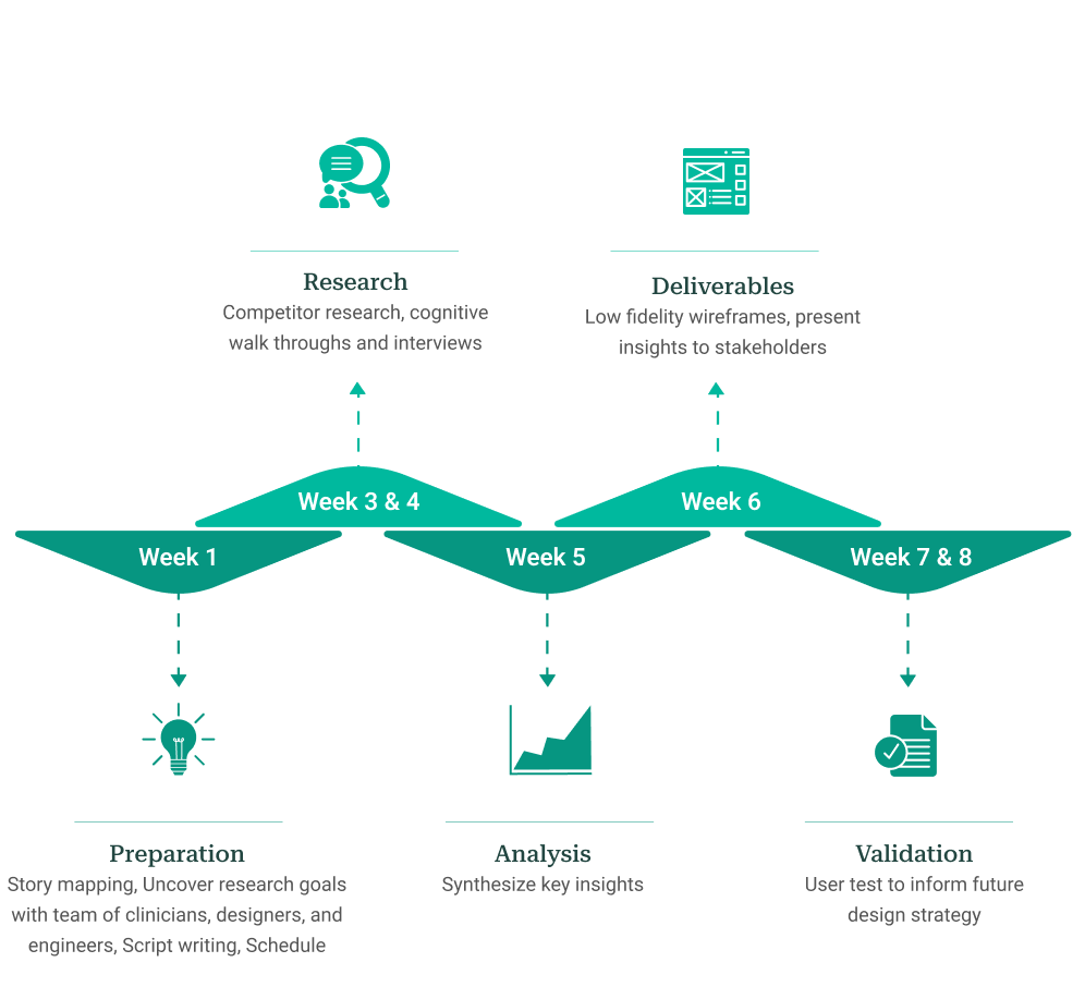
Project Timeline
Preparation
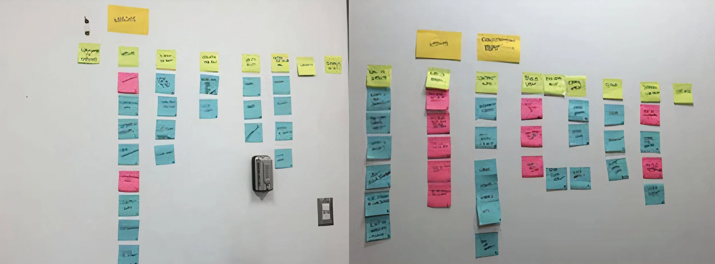
Story Mapping
During a meeting with various team members (clinicians, designers, engineers) the PM and I
mapped out the current user flow using sticky notes. This enabled us to see a student’s
journey once they entered the STAND website, and gave us insight to the
lengthy process involved to sign up for the mental health tracker.
We brainstormed ideas to reduce the length of this
process, and mapped out an ideal user journey.
Mapping user flows with stickies
Competitor Research
Through competitor research, I was able to evaluate other mental health services sites to determine their strengths and weaknesses. I also wanted to discover new opportunities to improve the website’s information architecture and increase engagement with users. Since a few stakeholders were unfamiliar with online competitors, it was important to immerse them into this new world to introduce standards within online mental health services and opportunities to innovate STAND’s website.
Through remote and in-person interviews, I was able to discover how users interacted with the current mental health screening and figure out their pain points.
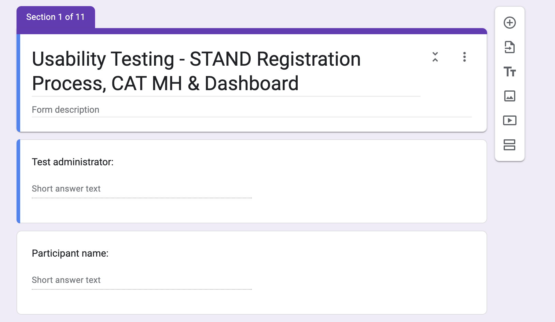
Usability Testing and User Interviews
Previously, usability testing had solely been conducted with the internal team. Feedback was lacking from our users (new students who are looking to register, and sign up for MHT) We needed a defined picture -
Who are they?
Have they ever used a similar service?
Are they familiar with other treatments on campus, and the way in which their website operates?
We also needed a cognitive walkthrough to understand how they would navigate the site and observe in which ways they navigated the site themselves to find the mental health tracker.
(screens users navigated through on the old site)
How did we actionize the findings?
Post it notes/trello to organize responses with affinity mapping - card sort and categorize into different steps of the process
Low fidelity wireframes based on findings
Low Fidelity Wireframes
I created low fidelity wireframes to show a better streamlined flow, clearer understanding that this is a research study and improved display of screening results according to the feedback I received.
Presentations
Weekly presentations with clinicians, researchers, and other important stakeholders allowed me to share findings on a continuous basis and involve important stakeholders in the research/design process. Since I was not familiar with certain procedures (such as IRB approval), it was important to discuss with important stakeholders to ensure that our ideas were practical, ethical, and able to be implemented. I was also able to gain deeper insight into what other members of the organization were working on and the feedback they received from students about other parts of the program (online therapy, in-person treatment) to inform my own strategy.
Validation: More Usability Testing
After the registration process and screening was redesigned, it went live on UCLA’s website. Through additional user testing of the new registration and screening, we were able to make sure that we were able to improve student’s experience through the new registration and alleviated the pain points that were discovered. In addition, this gave us a chance to validate our design strategy and figure out if there were any flaws or pain points with the redesign.
Impact
Users understood the research aspect of the program much more clearly and liked how straightforward the new process was.
A positive and efficient collaboration between the UX/PM team and clinicians/researchers, they really took into account the students’ feedback on the old design and process.
Competitor research gave clinicians/researchers a perspective on what the industry standards are which was taken into account into the new design of the site.
Challenges
IRB approvals for any of our proposed changes took a lengthy amount of time, for example: following IRB guidelines, signified that we could not advertise any incentives for participating in the research study such as the treatment being free, our challenge was - how do we engage new participants, college aged, who are more likely to be familiar with platforms such as BetterHelp, etc. and compete against a long standing clinic that already existed at UCLA that didn’t have a digital presence but students felt they could trust.
How I overcame these challenges
Understanding the sensitivity and vulnerability that students have when dealing with mental health issues and signing up for a research study, having empathy when conducting interviews with them to truly understand what would make the registration process feel safe for them.
Regularly checking in with clinicians and researchers on the team to gain perspectives on what they would like to see in the website and making sure to convey the importance of UX research in the process of redesigning the website.
Conducting competitor research with other similar programs that also follow IRB guidelines to follow standards.
Reflection
Working on this project was very rewarding because our work greatly improved and streamlined a process that those who are struggling with their mental health go through. I learned a lot about the current issues that students face when signing up for mental health services and gained a lot of knowledge about challenges with implementing new treatment from the clinicians. I felt that the PM and I made a great team, and I also appreciated learning how to communicate with a diverse group of stakeholders.

